Slides are a visual supplement to the primary medium of information – speaking – while documents are the primary medium of information.
Read MoreUse More Images
In a previous post, I introduced 2 Design Changes that Follow All Brain Rules.
2. Use More Images
For thousands of years the human brain has developed to process the visual input received through the eyes from the surroundings. Survival depended on being able to see the mammoth from far off, spot the snake in the grass, or the color of fruit in a tree. Only recently in its evolution has the brain's visual system spent so much time decoding letters, such as the ones that make up War & Peace. The cortex of the human brain has developed immensely to be able to read and ponder such literary works, not to mention complex scientific textbooks. And yet, even now, the brain still responds more actively to vibrant pictures.
Trade weapons for art. Replace your bullet points with high quality photographs. Bullet points are great for shopping lists and talking points, but not for getting your point across. They just don't work, because text is boring and lists are distracting.
If each item truly is that important, create a separate slide with a high quality image that represents the idea. Or use an image to represent the overall idea of the list, and verbally give the key points of the idea.
Go ahead and bleed. Using a full screen image is much more effective than copying the thumbnail from a Google search. Instead, download the full resolution file and fill the screen with it.
[caption id="attachment_72" align="aligncenter" width="300" caption="Fill the screen with image for more impact"] [/caption]
Don't clip to save. This is one instance when cheaper isn't better. Don't use the built in clip-art for graphics. Dip into your classroom funds and purchase stock images for the really important lectures. Web sites like iStockPhoto sell high quality images for relatively low prices. Once you sign up as a member, you can access their Free Image of the Week. Collect these over the years and you'll have a substantial library of great images that are bound to fit in to your lecture slides somewhere.
[caption id="attachment_401" align="aligncenter" width="240" caption="Purchase high quality stock images for important presentations"] [/caption]
Join the commonwealth. Ok, so most classroom budgets won't get you very far, but there are alternatives. You can access a wealth of images created by amateur and professional photographers who license their images for reuse – it's called a Creative Commons license. I explained how to do this in a previous post.
But that's not all! There are many organizations who provide many of their images for free. Just for starters, visit some of these sites:
- NASA Photo Gallery
- Associated Press Images
- LIFE Magazine (hosted by Google)
- Bureau of Land Management Image Library
[caption id="attachment_397" align="aligncenter" width="270" caption="NASA provides high quality images for public use."] [/caption]
DIY. If you're still struggling to find the image that you want, get creative and Do It Yourself. Grab a digital camera (a 3-megapixel camera is commonplace today and is sufficient quality for a presentation) and make the image yourself. Take a moment to review some basic photography concepts, such as the Rule of Thirds and lighting, at a website like Digital Photography School and then go out and explore your inner Ansel Adams.
There is so much more that we could discuss in relation to the use of images in your lecture slides, but they can be addressed in future posts. For now, see how you can improve one of your lecture slide decks by using less text and more images.
Doctor's Orders: "Burn Your PowerPoint Presentations"
Use Less Text
A few weeks ago, I introduced 2 Design Changes that Follow All Brain Rules.
Use Less Text
Everyone has heard the phrase, "A picture is worth a thousand words." Turns out, it's true. Written language has evolved over the years from cave drawings and paintings. Indeed, text is nothing more than a series of very simple pictures. For this reason, the brain takes considerably longer to decode strings of text (i.e. bulleted sentences) than it does single words or short statements. In other words, pictures are faster at conveying information than words – at least when we're talking about concepts and ideas (detailed data is difficult to convey via words or pictures – which is why scientific papers turn to tables and charts).
Here are two steps you can take to use less text.
1. Whittle your titles. Take the time to reduce slide titles down to their core meaning. This will remove clutter and superfluous information that can confuse and distract your students. Use short, concise titles to get the main point across. Then fill in the gaps while lecturing. This allows the student to understand the context which aids in better retention of the details you provide.
Oftentimes, I find a lot of redundancy in slide titles throughout a lecture. For instance, "Using Peer Mentors to Drive Students Toward Deeper Learning and Productive Reflective Writing" could become "Peer Mentors Improve Learning."
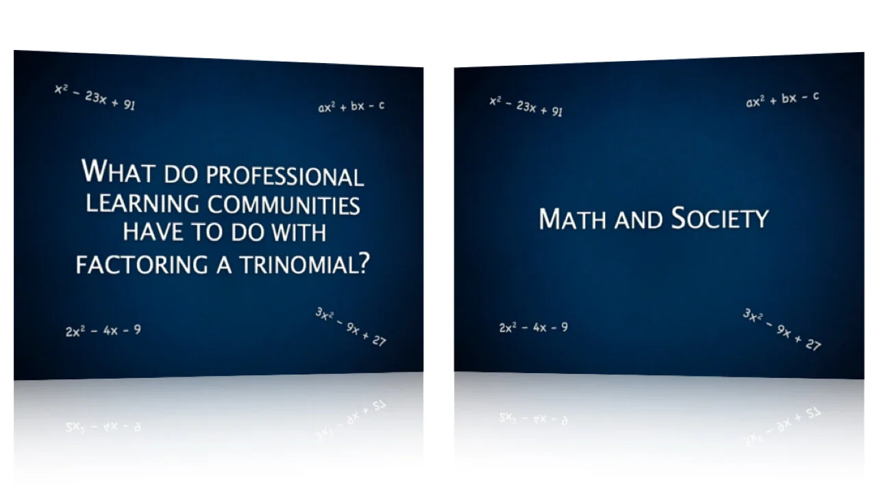
"What Do Professional Learning Communities Have to Do With Factoring A Trinomial?" could become "Math and Society" or "The Role of Math in Society."
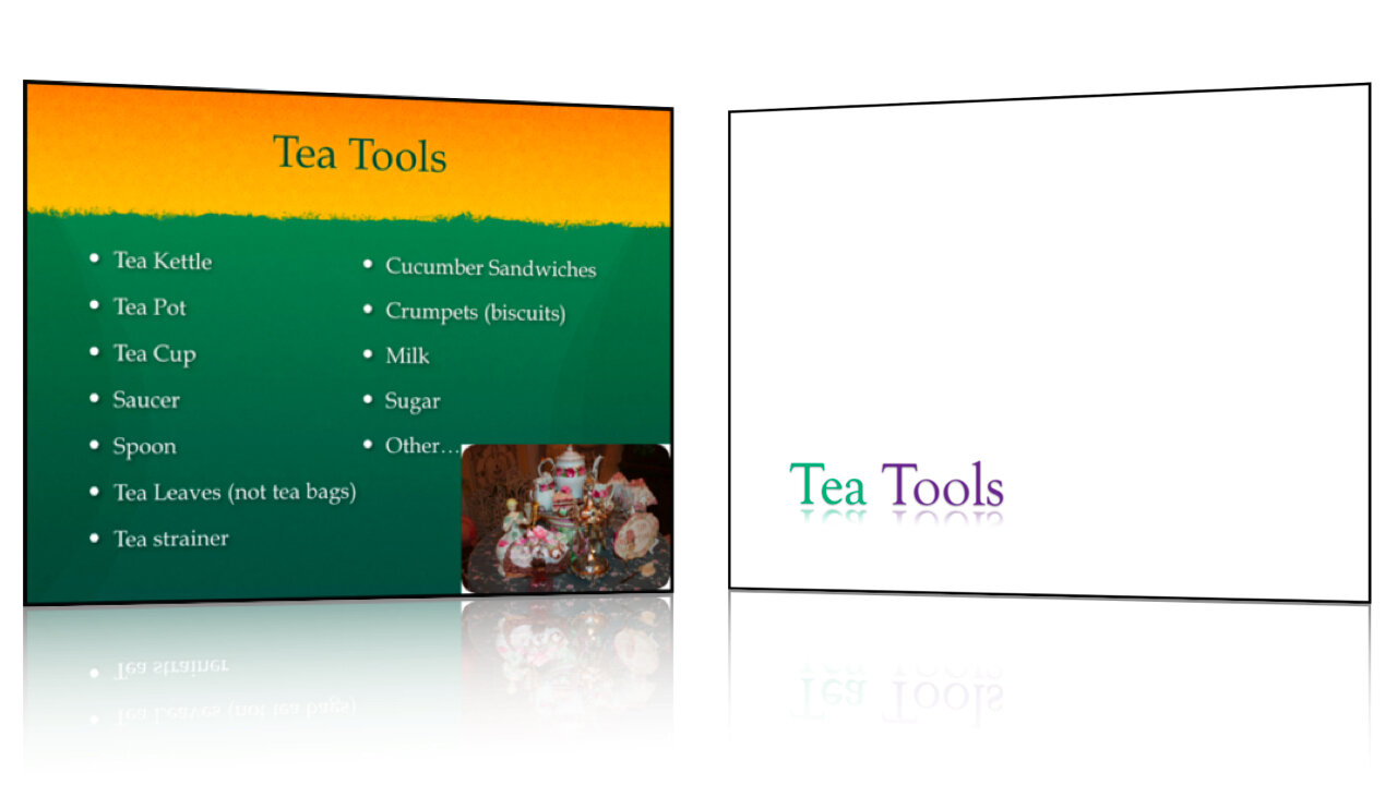
"A History of the Culture of Tea in Britain" might be simplified as "British Tea Culture."
2. Remove bulleted text. Bullets on a slide often serve only as lecture notes to prompt the professor and are not necessary for the students. Sure, they need to know the information, but you're going to explain the important concepts during the lecture. If you need those notes while you're presenting, cut and paste them into the Presenter Notes in your slideware. You can then print off the slides as lecture notes or use Presenter Mode while in class. Remember, guns don't kill people, bullets kill people.
Makeover: Steven Baugh, Honored Alumni Lecturer
Every year, each college at BYU selects an Honored Alumni to return and speak to current students and faculty. Last fall I was privileged to work with Dr. Steven Baugh in preparing his presentation as Honored Alumnus of the College of Physical and Mathematical Sciences. Dr. Baugh is director of the CITES department of the McKay School of Education, and has taught math for a number of years. His interest with mathematics began with his father, who was also an accomplished mathematician and high school teacher. Working with Dr. Baugh was easy from the beginning, not only for his humility and willingness to accept suggestions, but also for what he provided me with as an outline. Unlike most presenters, Steven had not not yet created a set of slides. Instead he had simply typed up an outline of the things he wished to discuss. This made it very easy for us brainstorm the most effective presentation and create slides that best illustrated his message.
I have included a selection of slides as well as an animated version for you to view below.
2 Design Changes That Follow All Brain Rules
 Dr. Medina's Brain Rules are fascinating. Not in the same way that Brian Greene's eloquent description of The Elegant Universe is fascinating. No, it is much simpler than that. In fact, Brain Rules are fascinating because they are simple. While they are based on years of complicated scientific research and their implications are far reaching, Dr. Medina's rules to survive at home, work, and school are so simple that it is fascinating that we didn't think of them earlier.
In a similar way, it is nearly laughable to me that PowerPoint slides are still designed in a complicated and counter-intuitive manner. Due largely to the misused hierarchical organization techniques that are the foundation of Microsoft's templates, professors, lecturers, and students continue to fill their slides with line after line of boring, bulleted text.
Fortunately, the steps to improving lecture slides are as straight forward and obvious as are Brain Rules. In fact, there are two design changes that can be used on any slide deck to instantly improve it's effectiveness.
In upcoming posts, I will explore each of these in more detail and give practical examples of how they can make an impact. For now, see how you can apply them to your lecture slides.
William the [African] Conqueror: Of Windmills and Presenting
After a short TED Talk 'fast', I've started devouring these amazing talks again, and this 5 minute appetizer was sensational.
William Kamkwaba is a young African man who harnessed the power of wind to help feed his family and transform his small village. In this short presentation he shares his inspirational story.
What fascinates me is that William was able to give an engaging and motivational talk without having so much as a high school education. Most people who are inexperienced presenters tend to use the same crutches: default PowerPoint themes, bullet points, notes, few pictures. But not William. Notice the simplicity of his slides. Many of them are full-bleed photographs. He doesn't use bullet points and he speaks in a natural, conversational tone. Most importantly, his message comes from the heart. Building windmills, and engineering in general, is something that he loves.
William shows that you do not need to be a trained and experienced public speaker to present well. If you are a teacher or university professor, there are a few simple things that you can do to improve your presentations or lectures.
Enjoy the talk.
McKay ‘Canvas’ Presentation Theme
I just finished designing a Keynote theme for the McKay School of Education at BYU. I think it came out really well and can't wait to show it to the administration. Here is a very short video sample of the presentation.
Thanks to Tyler Lewis who helped design the backgrounds.


