Episode 3: Thinking Visually

With special guest, Ana Foureaux Frazão, Freelance Presentation Designer in San Francisco, California.
Brainslides_Episode_3_Visual_Thinking.mp3 Listen on Posterous

Ana's Pick:

SOAP – Amazing PowerPoint Presentations: http://youtu.be/UJDJVuAwB0M

Mike's Presentation Pick:
Aagh! The episodes are getting longer! We value your time and appreciate that you listen. We are working to adjust the format of the show to create shorter episodes with more concise content. As always, please give us your feedback by e-mailing us or leaving a comment on the blog.
And subscribe to the show in iTunes to automatically receive future episodes.

Another argument for NO HANDOUTS

handout

I'm running the tech for an educators' meeting this morning (I wasn't involved in the preparation of this presentation).

As is customary, the presenter provided their PowerPoint slides as handouts to the attendees. These were printed the day before, but the presenter mentioned to me that she had made some quick changes last night. A few minutes in, she advanced to a slide that wasn't in the handout.

I underestimated the repercussions – nearly every attendee began flipping through the handout searching for the elusive missing slide! Their attention was completely diverted from the presenter – who either didn't notice or didn't think to explain that the slide was missing from their handouts.

To add to the disruption, I was controlling a pre-loaded version of the presentation for a webcast. I also received the slides before the edits, and was not sure whether I skipped a slide, missed a slide, or what!

This is just another example of the drawbacks to providing handouts to the audience before the presentation. It is better to prepare a proper document to accompany the presentation (not just a copy of the slides) and provide it after the presentation.

Bill Gates - The Little Nerd that Could

As a self-admitted, die hard, Apple fan-boy, it feels a bit strange for me to recommend a talk by the chairman of one of Apple's biggest rivals. But I respect improvement, and from what I've seen of Bill Gates, he is my top pick for Most Improved in the area of presentation skills. Not only does he now have great slides, but his delivery was much improved. It appears as thought Bill has taken the time to prepare the content of his talks, put forth the effort to design them well (or, more likely, the money to hire someone to design them), and accepted help from a speaking coach.

Read More

A Solution to Slideuments

Recently, there has been some discussion among various presentation blogs on the practice of distributing handouts to accompany presentation slides. (Visit Speaking About Presenting or Phil Presents to get caught up and learn some great tips.) This topic goes hand in hand with my own previous posts on slideuments and docuslides, since most presenters create their slides to also serve as a handout (resulting in slideuments), while a few presenters present their documents (resulting in docuslides). The problem with both slideuments and docuslides is a misunderstanding of how information should be presented. As I have explained before, lectures and presentations primarily utilize oral information with visual supplements. Documents – papers, essays, books, etc. – are primarily textual information. Documents are meant to be information dense, while slides are not.

Let me restate this more transparently:

  • If you are presenting a lot of information, non-verbally, create a document.
  • If you are presenting orally and want visual aids, create slides.

It really is that simple! If you are e-mailing, mailing, distributing handouts, or otherwise delivering information which will stand on it's own, it does not make sense to use PowerPoint or other slideware to create the document!

One solution to slideuments is to create both a document and accompanying slides – and it doesn't take as much work as you might think.

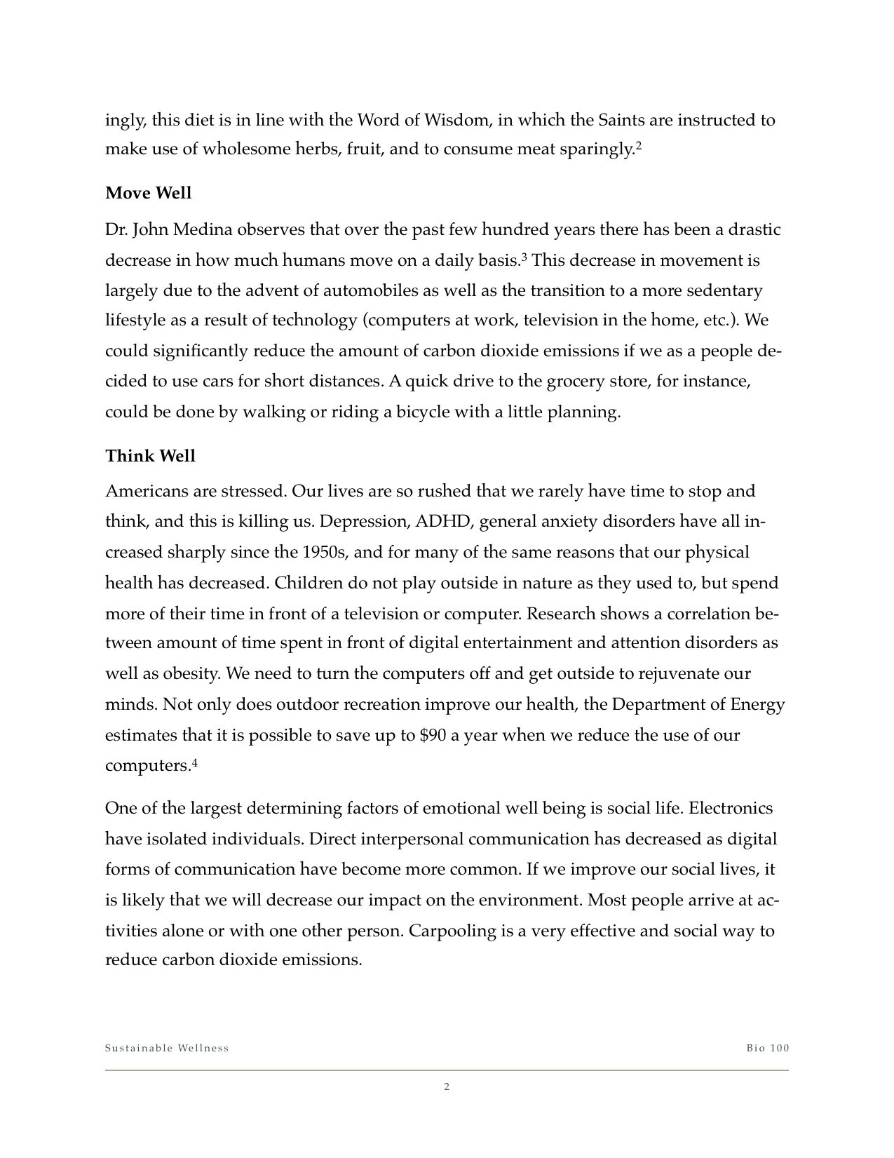
Some time ago I was required to write a final paper and give a presentation on the same topic for my biology class. I chose to research sustainable practices for healthy living. First, I wrote my paper using Apple's Pages (a word processor similar to Microsoft Word). Once that was complete, I then began to select the important points that I would cover in my presentation. I created a slidedeck using the same titles, images, and order of topics.

Click here to download the full paper: Biology 100 Final Paper

Biology Final Presentation

You can download the slides by visiting Slideshare.net.

There are two important things to remember:

1. Create the document first.

You should never begin preparing for a presentation by creating your slides first. The act of creating slides tends to lead to tinkering with the technology. In fact, don't even design the document yet, just write out what you're going to present on in a free flowing fashion. (Garr Reynolds of PresentationZen fame, and Nancy Duarte both refer to this as going 'analog'.) Worry about the accompanying images and layout later.

2. Use the same design elements.

Basic design principles state that two things that are supposed to go together look alike. Use the same font, color scheme, and – of course – images! People remember images up to 6x more than what they hear, so using the same images in both your document and presentation will lead to them remembering what you said.

Slideuments are an unnecessary, and unfortunate, habit among office personnel, presenters, and teachers. I have been subject to both extremes in my education. On the one hand, I've taken courses in which textbooks are all but replaced with printed PowerPoint slides... with random words blanked out as if it were a Where's Waldo game! On the other hand, I've sat in class, day after day, as the professor read off of web pages that contained the material for the course. I can understand how these practices might appeal to the professors – they're very convenient and require relatively little preparation for lecturers who are often more concerned with putting the final touches on their grant proposal or spending time in the research lab. But using docuslides or slideuments take valuable opportunities away from the student.

In the end, slideuments do not match Dr. Diamond's test of "using things that have been shown for learning, rather than just keeping up with the technology."

Prezi in Education

New technologies are always developing that can be useful in the classroom. Over the past couple of years, Prezi started as a small start-up with a unique idea and has developed into a very usable alternative to PowerPoint and Keynote for creating presentations.

Prezi is very different in that, rather than a collection of slides presented in linear fashion, the presenter prepares a canvas that contains all of the material – text, images, even online content – that can be browsed, zoomed, spun, and more. You may be familiar with the idea of mindmapping – starting with a core concept and connecting related ideas in a web-like diagram. Prezi builds on this idea and adds an interactive level.

300px-Guru_Mindmap.jpg

Where Prezi really shines in the classroom is the ability to show the big picture as well as the finer details.

Recently, the team at Prezi launched a resource called Prezi Explore, a collection of presentations licensed for reuse and adaptation. This is an excellent resource for teachers who can grab a prebuilt presentation on a difficult concept and use it to give a new perspective to their students.

One of the Prezi presentations included in this section explains how Prezi can be used as a teaching tool. Browse through it and see some really great examples of how the tool can be used in the classroom to help students have a better understanding of the topic.

If you like what you see, go ahead and sign up for Prezi – it's free for the public, plus they offer free upgraded accounts to individuals with a .edu e-mail address.

Companion Term for Slideument

Last week I shared my thoughts on Kashi's confusing use of slides to present what was essentially a document. In retrospect, I might have been a bit incorrect using the term 'slideument' which more accurately applies to a set of slides that read like a document.

Two great examples of slideuments are 8 Keys to Effective Lecture by Terry Doyle at Ferris State University, or How Do I Use PowerPoint to Teach by Patrick Crispen (links are direct downloads to the PowerPoint files).

While the content in both of these presentations is valuable, presenting it in slide form does not make sense, since they were dense with text, did not use many visuals, and flowed much more like an essay.

On the other hand, Kashi's Yearbook celebrating 25 years was designed as a document but presented as slides... docuslides?? With this practice becoming common with online services such as SlideRocket and Slideshare, maybe it's time to coin a new term to use in conjunction with slideument.

Docuslides. I like it.

What do you think?