Use More Images

In a previous post, I introduced 2 Design Changes that Follow All Brain Rules.

2. Use More Images

For thousands of years the human brain has developed to process the visual input received through the eyes from the surroundings. Survival depended on being able to see the mammoth from far off, spot the snake in the grass, or the color of fruit in a tree. Only recently in its evolution has the brain's visual system spent so much time decoding letters, such as the ones that make up War & Peace. The cortex of the human brain has developed immensely to be able to read and ponder such literary works, not to mention complex scientific textbooks. And yet, even now, the brain still responds more actively to vibrant pictures.

Trade weapons for art. Replace your bullet points with high quality photographs. Bullet points are great for shopping lists and talking points, but not for getting your point across. They just don't work, because text is boring and lists are distracting.

If each item truly is that important, create a separate slide with a high quality image that represents the idea. Or use an image to represent the overall idea of the list, and verbally give the key points of the idea.

Go ahead and bleed. Using a full screen image is much more effective than copying the thumbnail from a Google search. Instead, download the full resolution file and fill the screen with it.

[caption id="attachment_72" align="aligncenter" width="300" caption="Fill the screen with image for more impact"]Sample Slide Using Full Bleed Image[/caption]

Don't clip to save. This is one instance when cheaper isn't better. Don't use the built in clip-art for graphics. Dip into your classroom funds and purchase stock images for the really important lectures. Web sites like iStockPhoto sell high quality images for relatively low prices. Once you sign up as a member, you can access their Free Image of the Week. Collect these over the years and you'll have a substantial library of great images that are bound to fit in to your lecture slides somewhere.

[caption id="attachment_401" align="aligncenter" width="240" caption="Purchase high quality stock images for important presentations"]Image from iStock Photo[/caption]

Join the commonwealth. Ok, so most classroom budgets won't get you very far, but there are alternatives. You can access a wealth of images created by amateur and professional photographers who license their images for reuse – it's called a Creative Commons license. I explained how to do this in a previous post.

But that's not all! There are many organizations who provide many of their images for free. Just for starters, visit some of these sites:

[caption id="attachment_397" align="aligncenter" width="270" caption="NASA provides high quality images for public use."]Image from NASA Image Gallery[/caption]

DIY. If you're still struggling to find the image that you want, get creative and Do It Yourself. Grab a digital camera (a 3-megapixel camera is commonplace today and is sufficient quality for a presentation) and make the image yourself. Take a moment to review some basic photography concepts, such as the Rule of Thirds and lighting, at a website like Digital Photography School and then go out and explore your inner Ansel Adams.

There is so much more that we could discuss in relation to the use of images in your lecture slides, but they can be addressed in future posts. For now, see how you can improve one of your lecture slide decks by using less text and more images.

Use Less Text

A few weeks ago, I introduced 2 Design Changes that Follow All Brain Rules.

Use Less Text

Everyone has heard the phrase, "A picture is worth a thousand words." Turns out, it's true. Written language has evolved over the years from cave drawings and paintings. Indeed, text is nothing more than a series of very simple pictures. For this reason, the brain takes considerably longer to decode strings of text (i.e. bulleted sentences) than it does single words or short statements. In other words, pictures are faster at conveying information than words – at least when we're talking about concepts and ideas (detailed data is difficult to convey via words or pictures – which is why scientific papers turn to tables and charts).

Here are two steps you can take to use less text.

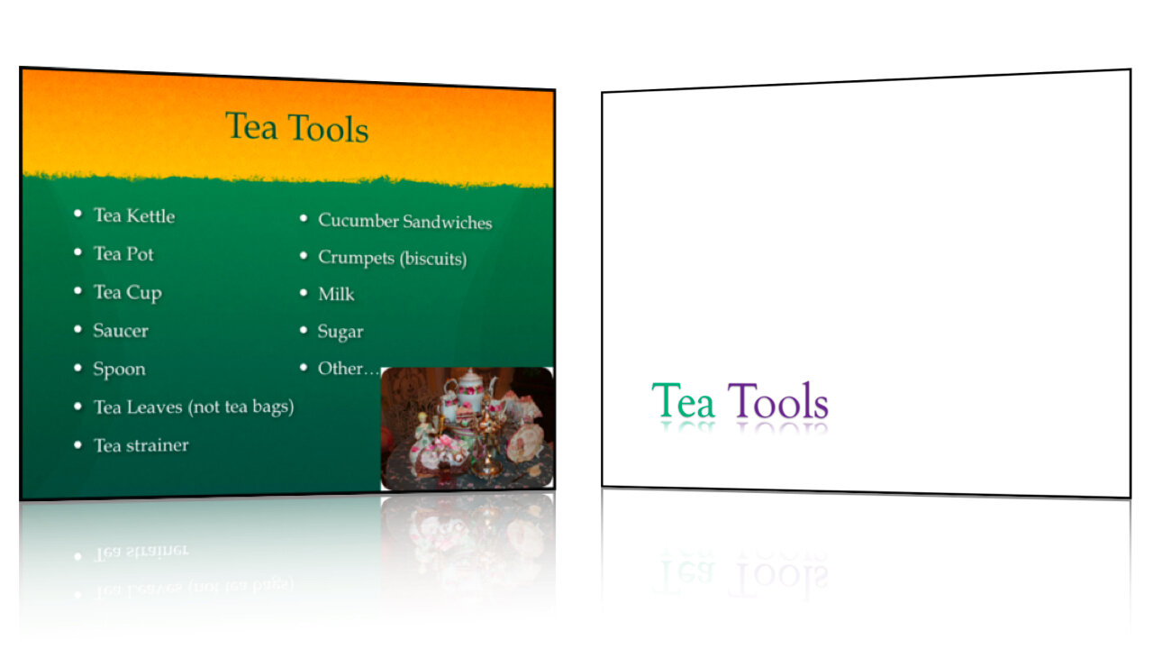
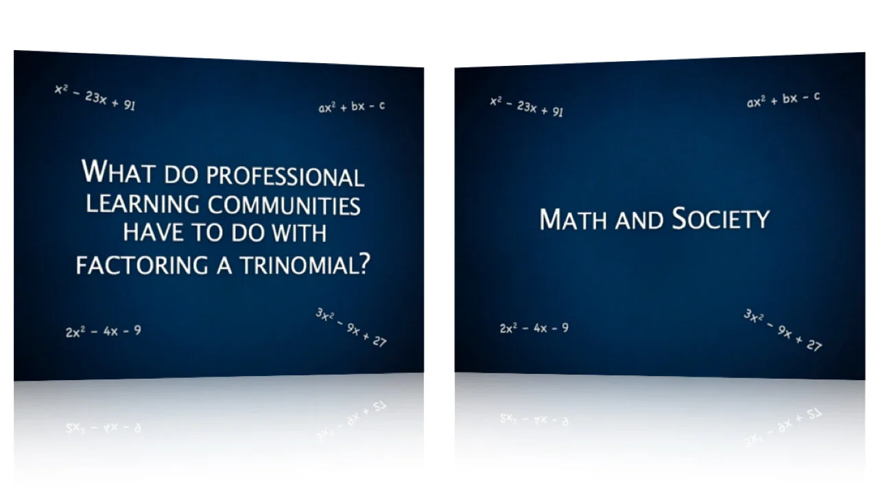
1. Whittle your titles. Take the time to reduce slide titles down to their core meaning. This will remove clutter and superfluous information that can confuse and distract your students. Use short, concise titles to get the main point across. Then fill in the gaps while lecturing. This allows the student to understand the context which aids in better retention of the details you provide.

Oftentimes, I find a lot of redundancy in slide titles throughout a lecture. For instance, "Using Peer Mentors to Drive Students Toward Deeper Learning and Productive Reflective Writing" could become "Peer Mentors Improve Learning."

"What Do Professional Learning Communities Have to Do With Factoring A Trinomial?" could become "Math and Society" or "The Role of Math in Society."

"A History of the Culture of Tea in Britain" might be simplified as "British Tea Culture."

2. Remove bulleted text. Bullets on a slide often serve only as lecture notes to prompt the professor and are not necessary for the students. Sure, they need to know the information, but you're going to explain the important concepts during the lecture. If you need those notes while you're presenting, cut and paste them into the Presenter Notes in your slideware. You can then print off the slides as lecture notes or use Presenter Mode while in class. Remember, guns don't kill people, bullets kill people.

Possibilities with the iPad

Yesterday, Apple released the iPad, "A Magical and Revolutionary Product at an Unbelievable Price." It was an instant hit, selling an estimated 600,000 - 700,000 in the first day.

As a true Apple fan, I spent a few hours playing with the iPad, on the day of its release, wondering what it could mean for the future of presentations in the classroom. Let me tell you that I am very excited.

Some people have criticized it as nothing more than a large iPod Touch. Frankly, they're not far off, and that is precisely why I am so excited. The iPhone/iPod Touch interface is very intuitive and natural to use. Because there is no mouse – you just use your finger – the learning curve is flattened out.

So why not just use an iPod Touch? There are two things that make the iPad different. First, it has more power. The iPad is more responsive and capable of running programs that require a lot of processing power. Second, the iPad has a 9" screen, and it is beautiful. It really becomes a window to another world.

Ok, so it's a fancy new gadget. So what? I'm glad you asked, because there's no point in getting excited over something new unless it has real, practical value. While I believe the iPad will make a huge impact in the education system, it probably don't have to go out and grab one just yet. Start saving your pennies, finish this semester, and put together a proposal for your school's IT department to convince them to get you one for the next school year. In the meantime, here are some things to start thinking about.

Students

The iPad will be the perfect student companion. While the on-screen keyboard will take getting used to, third party products can turn the iPad into a very useable digital notebook. Combine the Pogo Sketch Stylus with an app such as Mental Note and a student can type, draw, sketch, or write their notes on the iPad while recording audio from the lecture.

MentalNote_for_iPad_science.png


Textbooks

Apple provides a free app called iBookstore for the iPad which allows you to search and download electronic books much like on Amazon's Kindle. However, instead of grayscale text, you get beautifully formatted, multimedia enhanced, full color books. Major textbook publishers have already announced plans to release their titles on the iPad. No more 20 pound backpacks for 80 pound 6th graders!

Teachers

With it's iPod app for music and video, as well as the built in YouTube app, the iPad could be the single device to organize all of the multimedia content a teacher could want. Record a podcast for the kids to listen to at the beginning of class, download the most recent NOVA Science video podcast, watch a chemistry experiment blow up on YouTube, or play classical music during free reading time. Have a full screen seating chart with pictures and tap on each student that is absent. At a starting price of $499, it wouldn't be surprising to see iPads replace the full desktop in each classroom. And at 1.5 lbs, most teachers wouldn't hesitate to bring work home with them.

Presentations

While I comment on all aspects of education, this site is really about creating great presentations in the classroom, and the iPad will be a fabulous tool in that regard. Beyond the multimedia options I have already mentioned, Apple has released a version of Keynote designed specifically for the iPad. In addition, you can purchase a VGA connector to use the iPad with a projector. The device will change to a presenter display and show the presentation on the screen. While Microsoft has no plans to create a version of Office for the iPad, Keynote will open PowerPoint documents that have been e-mailed to the device.


New to the touch version of Keynote are on screen presenter tools. With a simple swipe from the left of the screen you can pull up all of the slides in the presentation and jump forward or back. Watch the first minute of this video of a hands-on demo to see it in action.

(Update: As you can see in the video, the demo shows an on screen drawing feature which allows you to annotate your slides much like on a white board or as sports commentators do. This feature is not functional on release versions of the iPad.)

Creating presentations on the iPad is a breeze and a delight. You can move objects just by touching them and add smooth transitions with ease. Typing isn't too difficult, but that doesn't matter because you use very little text anyway. Photos can be imported from your iPhoto library or saved to the device via e-mail.

To learn more about iPad, visit Apple's website and watch these Guided Tours.

Makeover: Steven Baugh, Honored Alumni Lecturer

Every year, each college at BYU selects an Honored Alumni to return and speak to current students and faculty. Last fall I was privileged to work with Dr. Steven Baugh in preparing his presentation as Honored Alumnus of the College of Physical and Mathematical Sciences. Dr. Baugh is director of the CITES department of the McKay School of Education, and has taught math for a number of years. His interest with mathematics began with his father, who was also an accomplished mathematician and high school teacher. Working with Dr. Baugh was easy from the beginning, not only for his humility and willingness to accept suggestions, but also for what he provided me with as an outline. Unlike most presenters, Steven had not not yet created a set of slides. Instead he had simply typed up an outline of the things he wished to discuss. This made it very easy for us brainstorm the most effective presentation and create slides that best illustrated his message.

I have included a selection of slides as well as an animated version for you to view below.

Slides Don't Speak, You Do!

In a recent lecture I attended, I heard the professor say the following as he advanced to the next slide in his PowerPoint, "So what this slide talks about is..."I thought nothing of it for a moment. I've heard people make the same comment many times in lectures, pitches, etc. As I looked at the slide, I thought if this slide could speak it would sound like a lot like a socially-inept scientist with an agile mind and free tongue! In other words: utterly incomprehensible. I sat patiently and hoped that the professor would translate the slide into English. If you have to explain what a slide 'says' then something is wrong with the way it is designed.

Slides do not talk. You do. Slides cannot teach, they can only help you teach.

Design your slides to follow what you would naturally say and to help illustrate complex or abstract ideas. Don't use slides as your lecture notes. Take advantage of (but don't overuse) slide transitions and animations to show the main idea and then progressively reveal the details as you talk about them.

William the [African] Conqueror: Of Windmills and Presenting

After a short TED Talk 'fast', I've started devouring these amazing talks again, and this 5 minute appetizer was sensational.

William Kamkwaba is a young African man who harnessed the power of wind to help feed his family and transform his small village. In this short presentation he shares his inspirational story.

What fascinates me is that William was able to give an engaging and motivational talk without having so much as a high school education. Most people who are inexperienced presenters tend to use the same crutches: default PowerPoint themes, bullet points, notes, few pictures. But not William. Notice the simplicity of his slides. Many of them are full-bleed photographs. He doesn't use bullet points and he speaks in a natural, conversational tone. Most importantly, his message comes from the heart. Building windmills, and engineering in general, is something that he loves.

William shows that you do not need to be a trained and experienced public speaker to present well. If you are a teacher or university professor, there are a few simple things that you can do to improve your presentations or lectures.

Enjoy the talk.